A Full-Width Layout for Criticker, and More!
As you have probably already noticed, today we debuted a new full-width style for Criticker, along with a whole bunch of changes that affect the entire site. Allow us to take you on a quick tour of the updates!
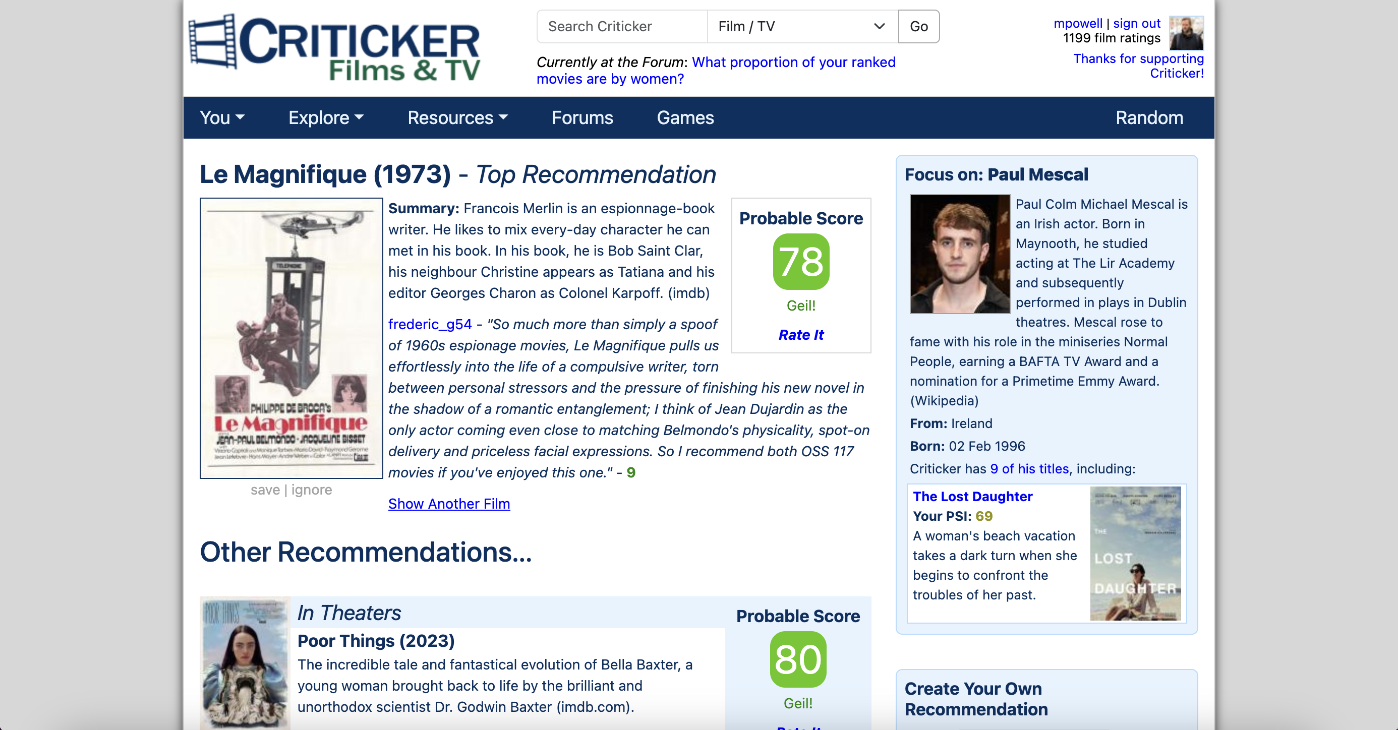
Full-Width Layout
Historically, the biggest complaint about Criticker has been that it looks dated. And the biggest reason for that, was that we cramped everything into a rather narrow frame -- at a time when most people are using much wider monitors.
We've now addressed that. In an update that touches literally every page on the site, we've expanded the layout of Criticker so that all of our amazing content has more room to breathe. Not every page has changed dramatically, but you should notice that the site feels less cramped.
 |
 |
The old layout and the new full-width layout
A New Look for the Title Information Page
Back in July 2023, we launched a revamped version of the Title Information page. Since then, we've been collecting feedback and working on "Version 2" of this page, which makes better use of the full-width layout. The new Title Information page includes a ton of updates, including:
A New Ratings Search Box - Search for other Criticker members or particular words within a review.

Infinite Scroll on Ratings - We now lazy-load ratings and reviews, so there's no need to "page over" to the next set. This was one of the primary pieces of feedback we received from users, after the initial revamp of the Title Information page.
Less Clicking and Page Loading - Going hand-in-hand with the removal of pagination is the fact that we've placed other sub-pages (Collections, Stats, Similar Titles, and Trailers) in tabs, so that you don't need to re-load the page.
New JustWatch Functionality - We've improved how we display where you can stream movies and TV shows, by greatly elaborating the modal so that it shows whether it's "included in a subscription", or how much the rental & purchase prices are.

New Compact Views - For both Ratings and Collections, we have new compact views that allow you to process information at a glance.
More Focus on Percentiles - When you're looking at lists of ratings, we now bring attention to the percentile, rather than to the individual score, so that you can see at a glance what the other person really thought about the title.
New Layout for Mobile - We've also made a ton of changes to the Title Information page on mobile devices, removing the large hero banner in order to fit more content above the fold, and improving navigation as well.
Site Cohesion
Behind the scenes, we've been working hard on a Design System for Criticker, creating rules and components that will apply to the entire site and make it much easier to understand and use. The Title Information page is the first launch of this new system, but we've also started incorporating elements throughout the site -- you might notice new colors, and even a new font. Sidebars are now uniform, and more modern.
Long-time users of Criticker will probably remember, rating a film on the Title Info page used to be a different thing than rating it from the Film Database, or the Recommendations Page, or the Search Results. We're moving away from that insane and impossible-to-maintain mish-mash, to a much more streamlined and consistent approach.
More to Come
As we've mentioned, all of these changes are just the initial steps. We plan on fully revamping every aspect of Criticker over the next months. Next up will be collections -- this is one of the most popular parts of the site, but there's so much more we could be doing with them. Also, we'll eventually be rebranding the site entirely.
The goal is to keep Criticker growing -- as you'll know, the more people we have using the site, the more TCIs you can generate, and the better chance you'll have of finding others who share your unique taste in films, TV, and games. And that will lead to better recommendations, which are the life blood of the site.
Just like Bella, we're going to be doing a lot of growing and learning... and there might be some issues!
As always, we'd love to hear your thoughts on the new look, the new Title Information page, and anything else you'd like to share! We love positive comments, of course, but appreciate critical and constructive comments just as much. Just let us know what you think!
This is a big change, so we know that there are likely going to be some issues. If you find any errors, please let us know via email to support@criticker.com. If you have more general feedback about the new layout, forward that on to info@criticker.com. Or you can always join the forum, and share your thoughts there!
As always, we have to give a huge shout-out to all the users who are helping support the site as Criticker Sponsors. We wouldn't be able to do it without you ... seriously!
And also, thank you to everyone for being a member of this incredible community! You all make this little corner of the internet what it is, and we hope you're as excited about the future of Criticker as we are!
